CTA
Branding
Web UX/UI Design
Paid Social Media
SEO
Paid Search
Industry
Services
Education
Training
Problem
The education and training space is highly competitive, particularly for training in the areas of construction and traffic. Previously known as Civil Training Australia, CTA realised their current brand and website looked ‘too corporate’, and wanted a complete, top-to-bottom overhaul of their brand, including re-designing their logo and visual identity, website and overall presence in the digital space. To try and capture audience attention and be the ‘point of difference’ they strive to be in their training, we needed to closely evaluate all aspects of their marketing and branding to deliver a set of thorough solutions.
Solution
We began with a full redesign of CTA’s visual identity, including a logo change, colour and typography updates, and a website refresh. This new visual presence allowed us to branch further out into paid advertising, with updated graphics helping us draw attention and be distinct from competitors in the category. We augmented this with a Paid Search and Social advertising strategy to ensure that CTA would begin appearing more prominently for prospective clients and students.
Branding + Web Design
CTA’s existing branding was struggling to distinguish them from competitors in the training industry and failing to deliver them the traffic that they required to grow. They required updated branding that would reflect their mission, with a focus on appearing more inviting and friendly, removing any overly ‘corporate’ elements, and visually standing out to viewers.
The existing CTA website was similarly built to be functional, but needed work to capture viewer attention and keep them on the page. CTA’s great programs and courses were right there to be accessed — they just needed the enticing visuals and branding to match.
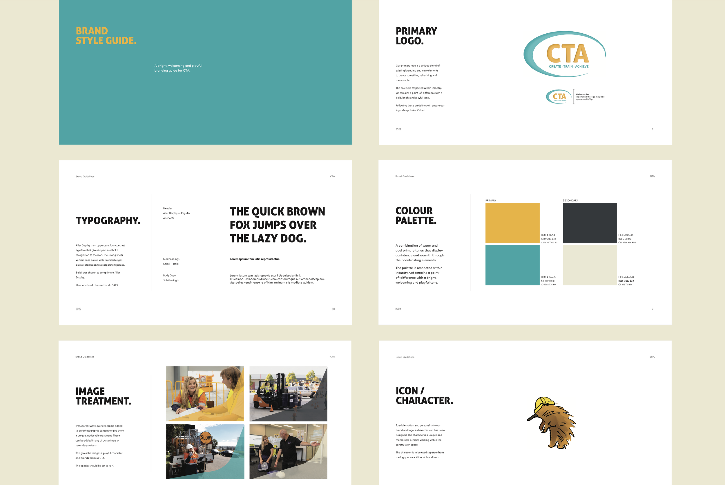
Developing new branding began with redesigning the logo, a process that went through multiple phases, pages of potential designs and a number of discussions. A variety of logos were presented to the client to give them a full spread of options to choose from, and to help affirm the new overall branding direction.
To partner the renewed logo, we analysed colour, typography and overall design and decided to go very against-type for the industries CTA trains in. The client was very interested in developing a new icon — a character to add emotion and personality to the brand. This represented a pretty significant challenge, trying to build a character from scratch that would comfortably sit within the overall branding scheme and come to be easily recognisable.
Process
Our work on the logo led us to a striking update that pays homage to where CTA has come from, but is firmly focused on where they are going. The logo also informed our refreshed colour palette: a combination of a warm golden yellow and cool teal blue, displaying confidence and warmth through their contrast. They are backed up by a dark grey and a cream to create an overall palette that is inviting without being overwhelming.
We paired the renewed visuals with a typeface built around strong vertical lines to reflect CTA’s confidence and quality, and rounded edges that highlight the brand’s warm and welcoming nature. All of these pieces interact to demonstrate an openness and give CTA an edge over competing RTOs with very distinct visuals.
Finally, our new character further enhances this presence, and we opted to go for a uniquely Australian creature — an echidna fondly named ‘Spike’ — matching CTA’s intent to provide training solutions for people all over the country. ‘Spike’ wears a hard hat and his presence in CTA’s overall branding scheme highlights their ability to balance a fun environment with high quality, actionable training.
Results

Paid Social Media
To complement CTA’s Paid Search strategy and get their branding in front of more eyes, we created tailored static ads for Facebook and Instagram to reach a high number of viewers. In pursuit of standing out even further, we also created TikTok video ads that showcased people going from everyday activities into training courses, highlighting the ease of access for students, earning potential, and the quality of CTA’s experiential training programs.
Process
Whilst our Paid Social Ad strategy did deliver a significant number of impressions, clicks (new traffic to the website) and actions, it didn’t deliver the results we had hoped for, and we eventually decided to shift the spend away from Paid Social and increase the Paid Search advertising. On a very positive note, our creative TikTok ads were even recognised by the platform as ‘Top Ads’ and were used in the TikTok for Business Creative Centre to inspire others.
Results
FEBRUARY ‘22 TO MAY ‘22:
995,751
impressions
6,560
clicks
Paid Search
Beyond an updated visual identity, CTA’s biggest need was simply to get their brand name in front of more potential customers. We suggested a Paid Search strategy built around Google Search advertising, which would target branded keywords and training course searches, with a focus on location-based searches. While CTA is looking to expand nationally, targeting and capturing the Melbourne-based searches was identified as a priority to firmly establish their brand in the market.
Process
Our Paid Search strategy was able to deliver a significant number of actions and drove people to the site to sign up for courses. Our display advertising strategy involved the creation of fresh and bright visuals with key messages for retargeting website visitors, which were successful in keeping CTA front of mind and encouraging prospective students to return to the site. The category is one where students often go through a research process before settling on a training provider, and retargeting display ads ensure that CTA remains present in a consumer’s decision-making process.
Results
MARCH ‘22 TO AUGUST ‘22:
55,680
impressions
5,787
clicks
370
actions


