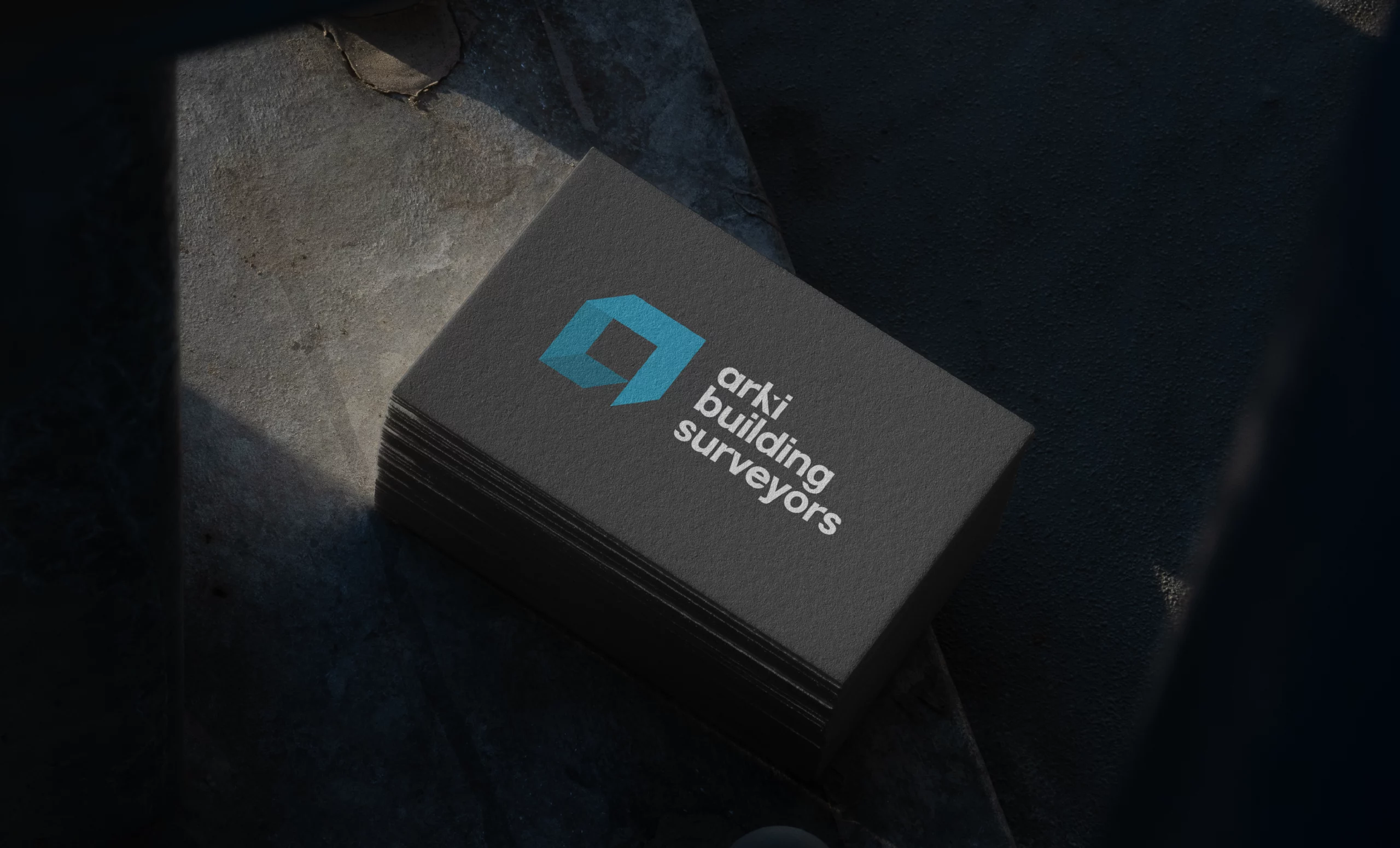
We isolated the ‘a’ from the original logomark to create a distinct element that is still recognisable. This new icon signifies the brand name while also having an ornate design reminiscent of a three-dimensional room — one of the basic building blocks of construction.
The full logo is finished with the brand name in a new typography, with a unique cut-out in the ‘k’, which not only captures immediate attention, but also evokes the lines and shapes that Arki confidently deals with in its work. The overall typography blends sharp lines with soft edges, proving Arki’s mastery in all forms of building.
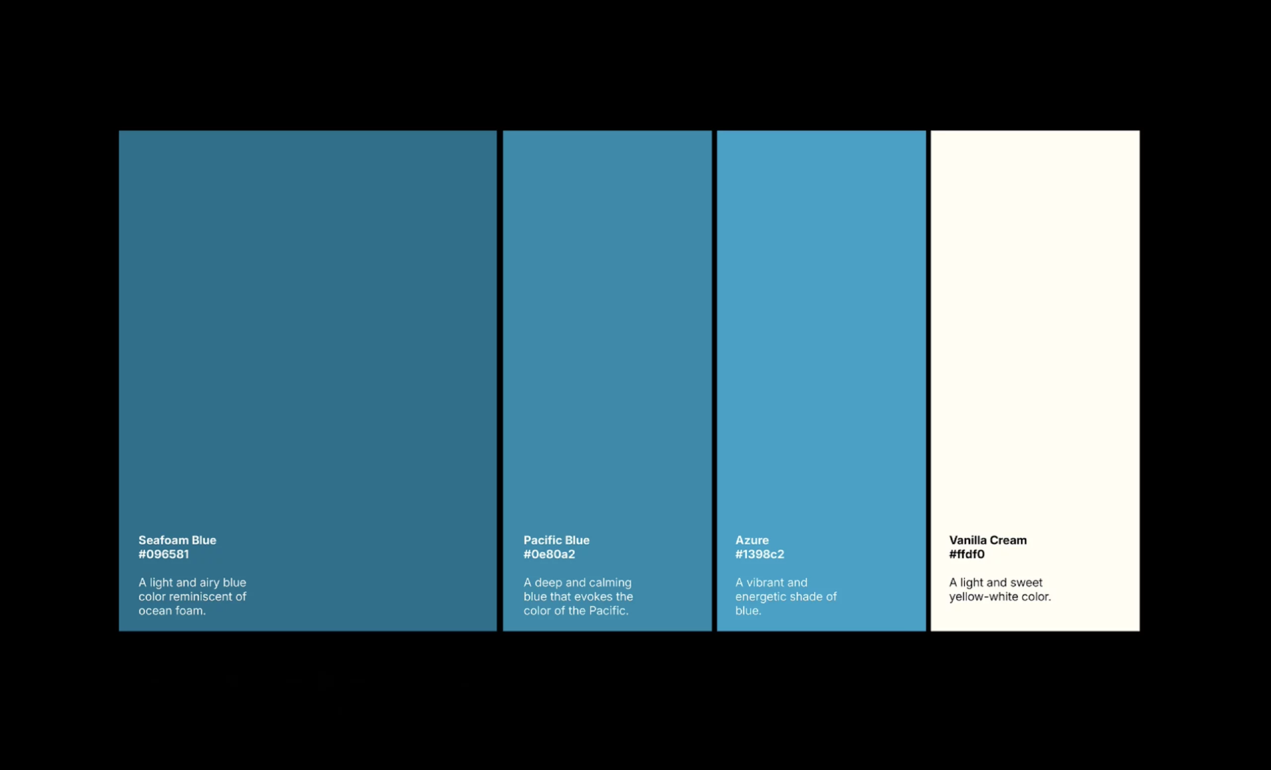
The renewed colour palette feels classic and confident, softening the existing colours to feel more modern while also expanding the palette with new secondary hues. Combining blue hues with cream and dark charcoal presents an identity that is equal parts professional, assured and inviting.