




Law
BTD Lawyers
The problem
BTD Lawyers was entering a new chapter, but their brand and website hadn’t caught up.
Previously known as Barbaro Thilthorpe Lawyers, the firm had appointed a new partner and needed an updated identity that reflected that change. The challenge was not simply to rename the business, but to evolve it carefully — preserving the recognition and credibility they had already built while creating a brand that felt ready for the future.
At the same time, their website was no longer supporting the firm in the way it needed to. The existing site felt dated, heavily templated, and offered a fairly basic user experience. It delivered information, but it didn’t do much to guide visitors, build confidence, or encourage enquiry.
For a firm handling complex and often high-stakes legal matters, that created a disconnect.The calibre of the practice wasn’t being matched by the way it presented itself.
The insight
In legal services, trust is built through clarity, confidence, and professionalism from the very first interaction.
For BTD Lawyers, the opportunity wasn’t to create a completely different identity. It was to create one that felt both established and forward-looking — something that acknowledged the firm’s history while giving it the flexibility to grow under a new structure.
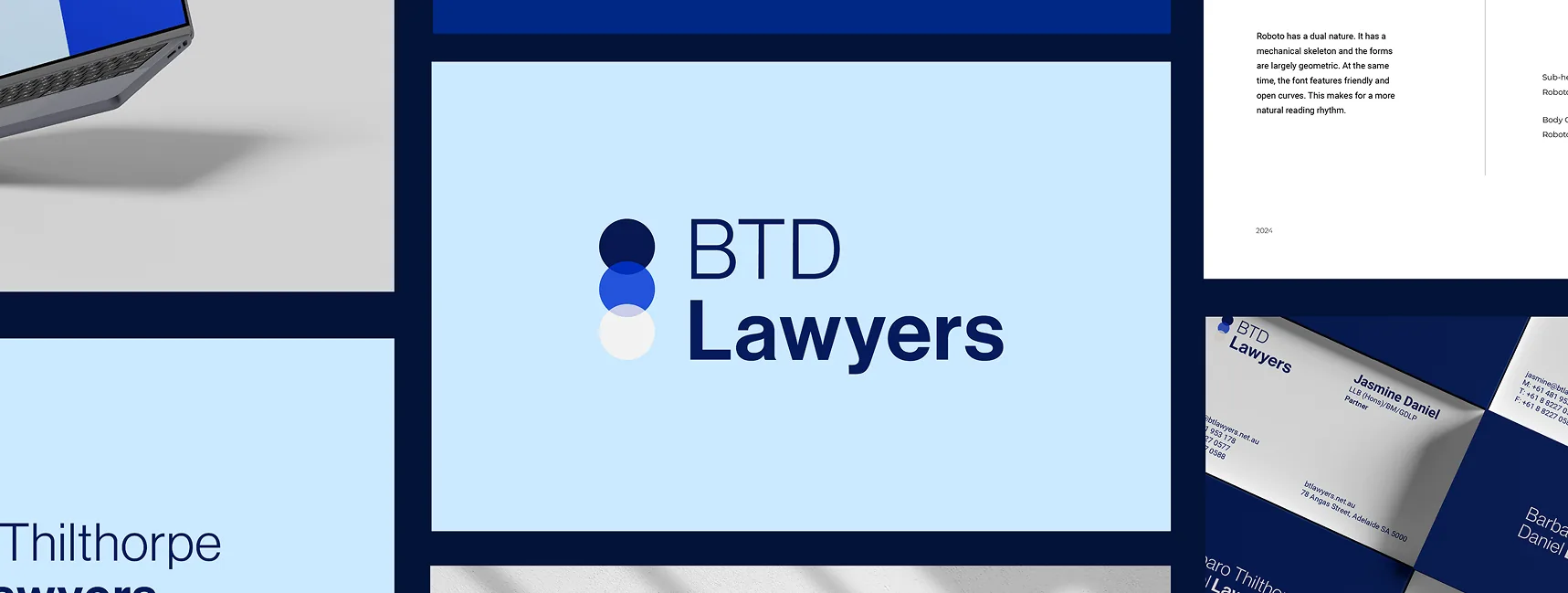
We recognised that the acronym BTD Lawyers offered that balance. It was more concise, more modern, and more versatile across digital and physical applications, while still maintaining a clear link to the firm’s full name and legacy.
The website needed to do the same. Rather than simply looking more contemporary, it needed to make the firm feel easier to engage with — clearer to navigate, easier to understand, and more compelling to contact.
The strategy
Our approach was to evolve the brand and digital experience together, so the repositioning felt complete and cohesive.
The strategy centred on three priorities:
- Creating a visual identity that could support both BTD Lawyers and Barbaro Thilthorpe Daniel Lawyers
- Modernising the brand without losing the equity built under the existing name
- Rebuilding the website to improve usability, strengthen credibility, and create clearer pathways to enquiry
The Execution
We began by working closely with the BTD team to understand what needed to be retained from the existing brand, what needed to change, and how the identity should function moving forward.
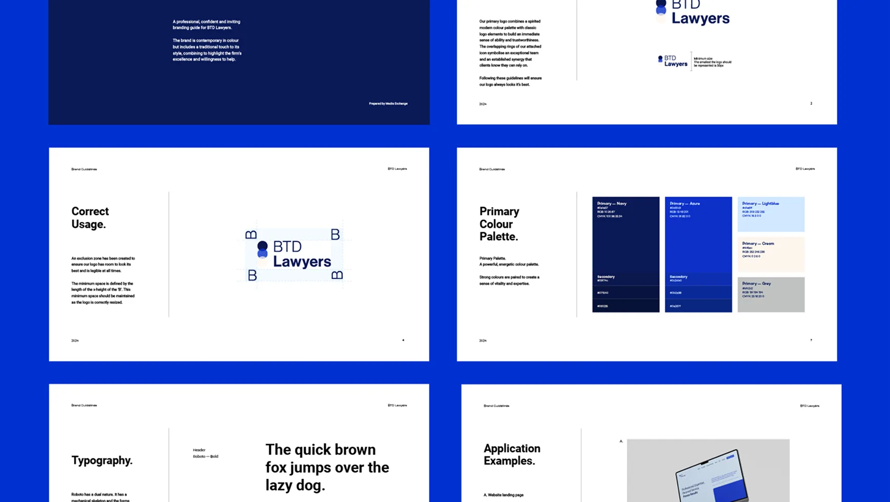
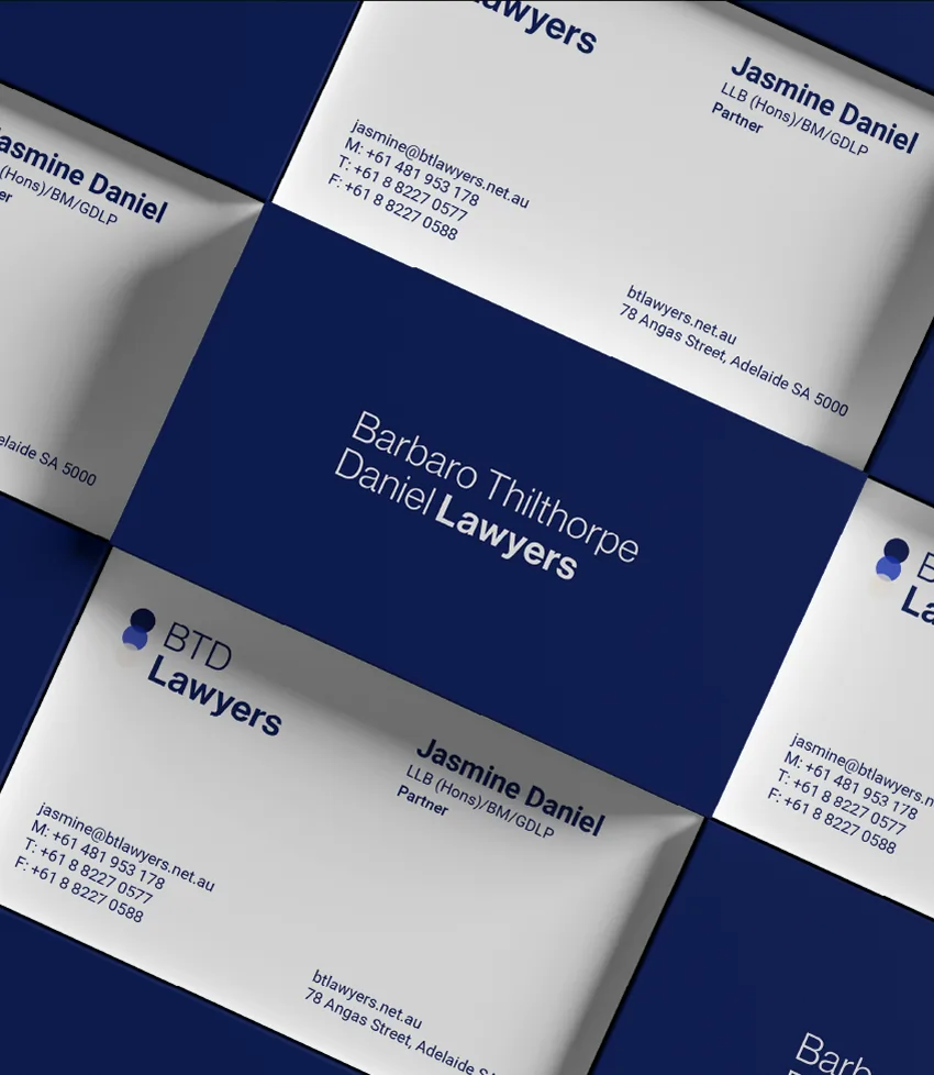
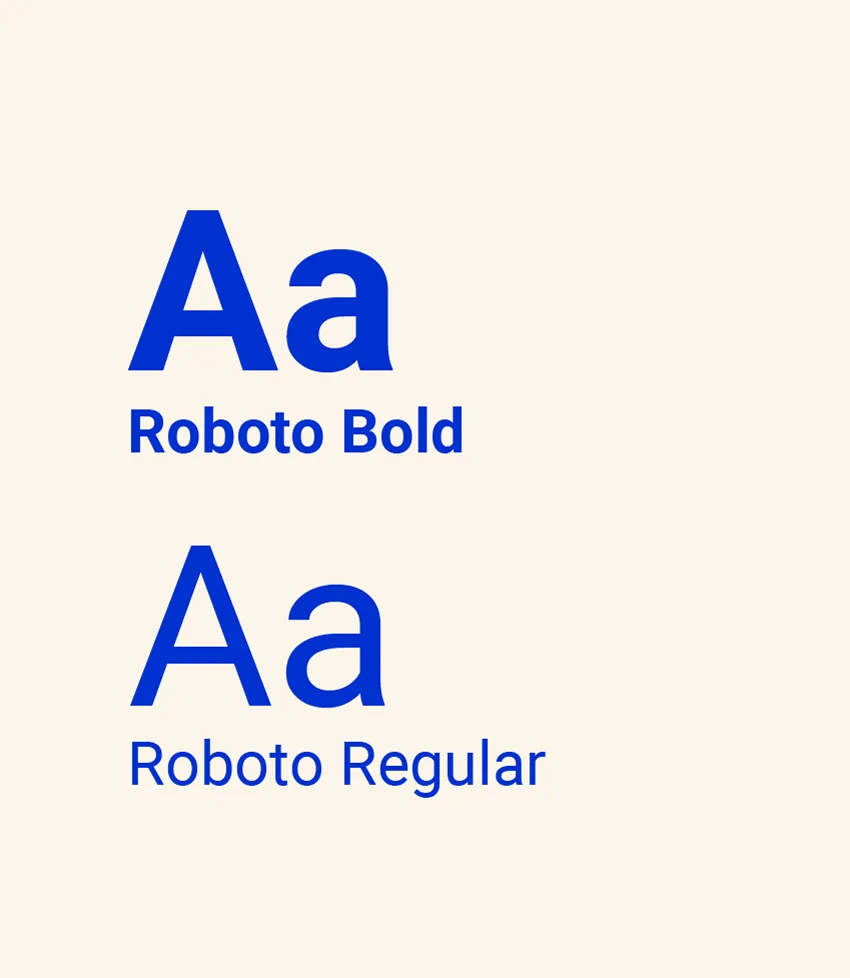
From there, we developed three distinct creative directions, each including logo concepts, typography, colour systems, and supporting usage principles. Through a collaborative review process, we refined those concepts into a final identity that felt both respectful of the firm’s history and more aligned with its future direction.
The final brand system prioritised the acronym BTD Lawyers, while also allowing flexibility to use the full name where required. New complementary colours were introduced to modernise the visual identity, while still retaining the sense of authority and professionalism essential in the legal sector.
With the brand established, we translated it into a complete website redesign. The process began with wireframes and a prototype, allowing the team to review and shape the structure before development commenced.
The final site was built in WordPress and included a full migration to a new domain, with careful attention given to preserving the site’s technical integrity throughout the transition.
Key improvements included:
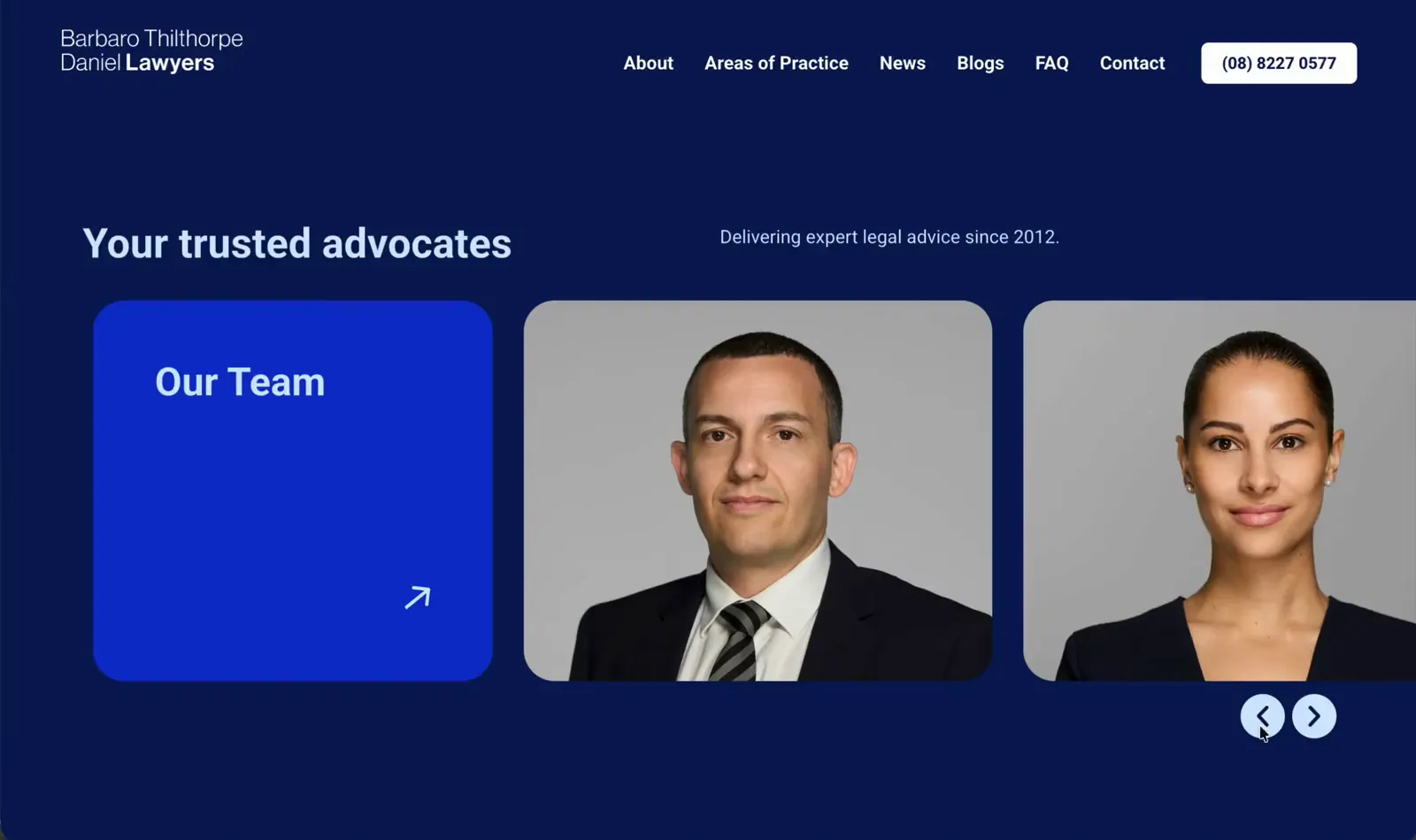
- A cleaner, more modern interface
- Better navigation across practice areas
- Clearer presentation of information
- Stronger calls-to-action and easier contact pathways

 Discovery Call