
Book a Call

Construction

Arki Building Surveyors

  • Branding
  • Website Design & Development

    The problem

    Arki had built a strong reputation — but their brand wasn’t reflecting the business they had become.

    With over 15 years in the industry, Arki Building Surveyors had established deep relationships across construction, architecture, and compliance. However, their visual identity and digital presence hadn’t evolved alongside that growth.

    Two key challenges emerged:

    • An outdated brand identityTheir existing logo and visual system no longer reflected the professionalism or confidence expected in a modern construction and compliance environment.
    • A limited digital experienceThe website was a single-page build, reliant on stock imagery and minimal content — making it difficult for new clients to understand their services or take action.
    At the same time, there was a critical constraint:the brand couldn’t simply start over.

    It needed to evolve — not erase — its history.

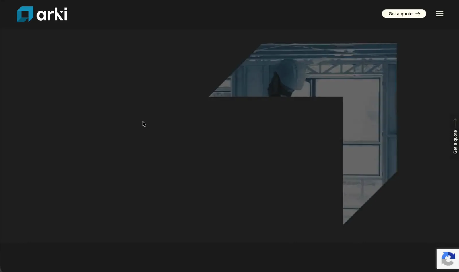
    Arki — campaign hero

    The insight

    In a technical industry, credibility is communicated visually before it’s proven professionally.

    For Arki’s audience — builders, architects, developers — trust is built through signals of precision, clarity, and expertise. And those signals are often formed in seconds.

    We recognised that the challenge wasn’t just to modernise the brand, but to retain its equity while elevating its perception.

    Because a complete rebrand risks losing recognition —but no evolution risks being overlooked entirely.

    The opportunity was to create an identity that felt:

    • Familiar enough to existing connections
    • Refined enough to compete in a modern market
    • Distinct enough to be remembered

    The strategy

    Evolve the brand, then build a digital experience that brings it to life.

    Rather than treating branding and website as separate projects, we approached them as one connected system.

    The strategy focused on:

    • Developing a refined visual identity anchored in the existing brand
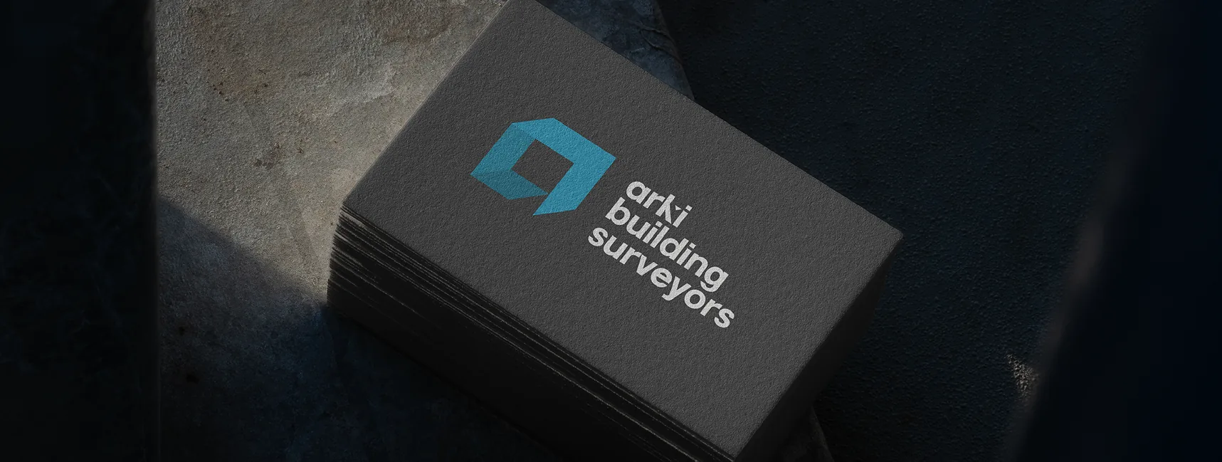
    • Introducing a distinctive logo mark to create stronger recognition
    • Translating that identity into a website that clearly communicates services and expertise
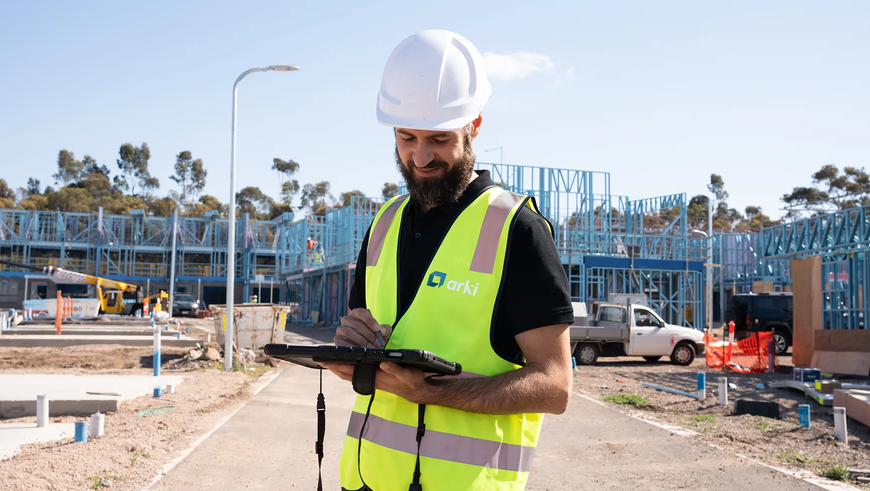
    • Replacing generic visuals with authentic project and team imagery
    The goal wasn’t just to look better —it was to build a brand that feels as considered as the work Arki delivers.

    Our Strategy

    The Execution

    1. Brand Identity Evolution

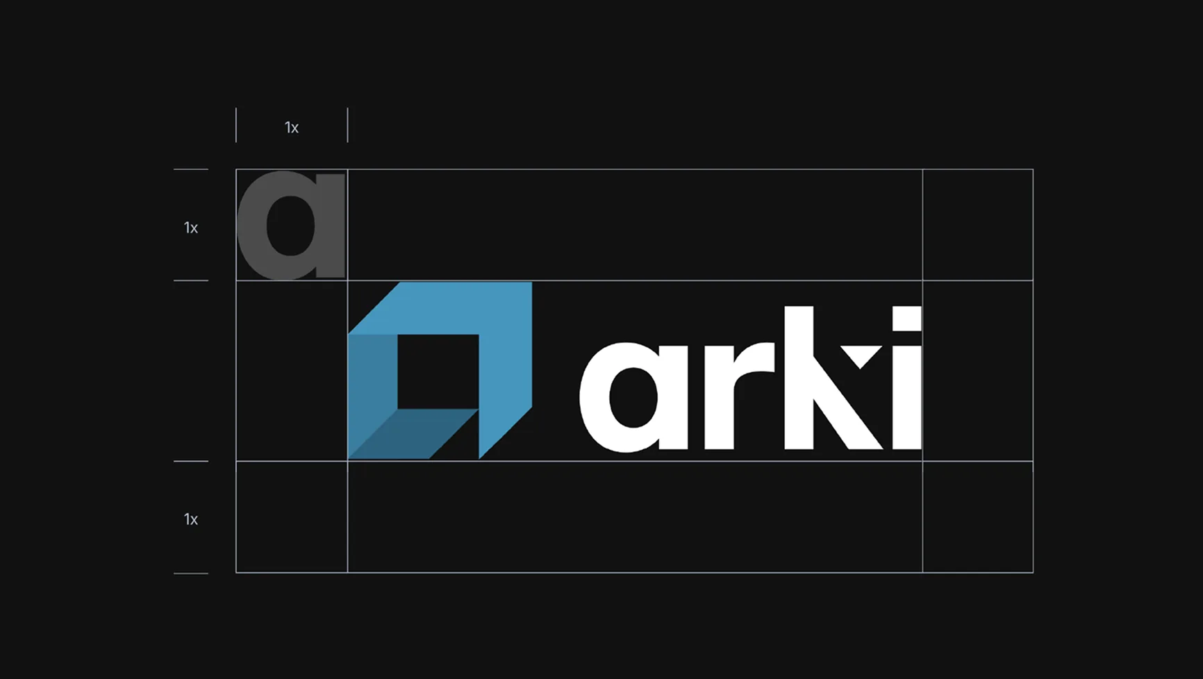
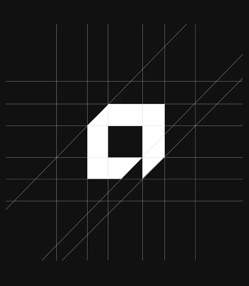
      We worked collaboratively with Arki’s directors, presenting multiple creative directions and refining them based on their feedback. The final identity strikes a balance between legacy and modernity. At its core: A new logo mark, derived from the original “a”, creating a recognisable and ownable symbol Subtle architectural cues within the design, referencing spatial form and construction principles Updated typography featuring a distinctive cut-through detail — adding both character and relevance to the industry The supporting system included: A refined colour palette, balancing deep blues with softer neutrals Primary and secondary logo variations for flexibility A comprehensive set of brand guidelines to ensure consistency

    2. Website Design & Development

      With the new identity established, we rebuilt the website to reflect both the brand and the business more accurately. The new site was designed to: Clearly communicate Arki’s full range of services Showcase projects and real-world applications of their work Provide multiple, intuitive pathways for enquiry Key improvements included: Replacing stock imagery with real project and team photography Introducing a structured, multi-page experience for deeper exploration Designing a clean, contemporary interface — anchored by a dark, refined visual system An animated logo introduction on the homepage adds a subtle moment of distinction, reinforcing the brand from the first interaction.

    The results

    The transformation repositioned Arki from a capable, established firm to a modern, design-conscious industry partner.

    The new identity:

    • Retains recognisable elements from the original brand
    • Introduces a distinctive visual mark that strengthens recall
    • Communicates professionalism, precision, and confidence

    The website now:

    • Clearly articulates Arki’s services and expertise
    • Provides a more engaging and informative experience for prospective clients
    • Aligns visual presentation with the quality of work delivered

    Business Impact

    Arki now presents itself in a way that matches its experience —established, considered, and confidently modern.

    By evolving rather than replacing the brand, the business has maintained its industry equity while stepping forward into a more competitive, design-conscious landscape.

    Because in a detail-driven industry,how you present your expertise is often the first proof of it.

    READY TO BE NEXT?

    Let’s find out what a strategy built specifically for your business could actually do.

    Book a Discovery Call